

UX Research & Usability Testing Report
Gas Money UX Audit
Project Overview
Summary
Gas Money is a platform that connects homeowners with local student workers for flexible home service jobs. Originally a high school lawn care business, it has grown into a full-service platform that empowers students while serving community needs. Our team conducted a usability audit of the app’s hiring process to evaluate how intuitive and user-friendly the experience was for homeowners.
Role & Responsibilities
My partner and I worked closely together to conduct all of the research and testing. We collaboratively planned and executed usability methods including empathy mapping, card sorting, and think-aloud protocols to uncover issues and shape our final recommendations.

Goals & Objectives
The goal was to identify usability issues and provide actionable design improvements to enhance navigation, feature clarity, and overall user experience.

Key Findings
Cluttered Interface: Users had trouble finding information due to visual overload.
Unstructured Options: Lack of clear job categories made browsing confusing.
Poor Navigation: Users found the app’s structure hard to follow.

Recommendations
Categorize Services: Organize jobs into clear, structured groups.
Add Bottom Navigation: Provide quick, consistent access to main features.
Enhance Search: Make finding and filtering contractors easier.
UX Research Methods
Created detailed user profiles to represent hiring-side demographics, goals, and frustrations.
PERSONAS
Explored emotional and cognitive user experiences to uncover pain points and motivations.
EMPATHY MAPPING
CARD SORTING
Identified how users organize services and navigation elements to improve app structure.
THINK-ALOUD PROTOCOLS
Observed users completing tasks to identify usability challenges in real-time.
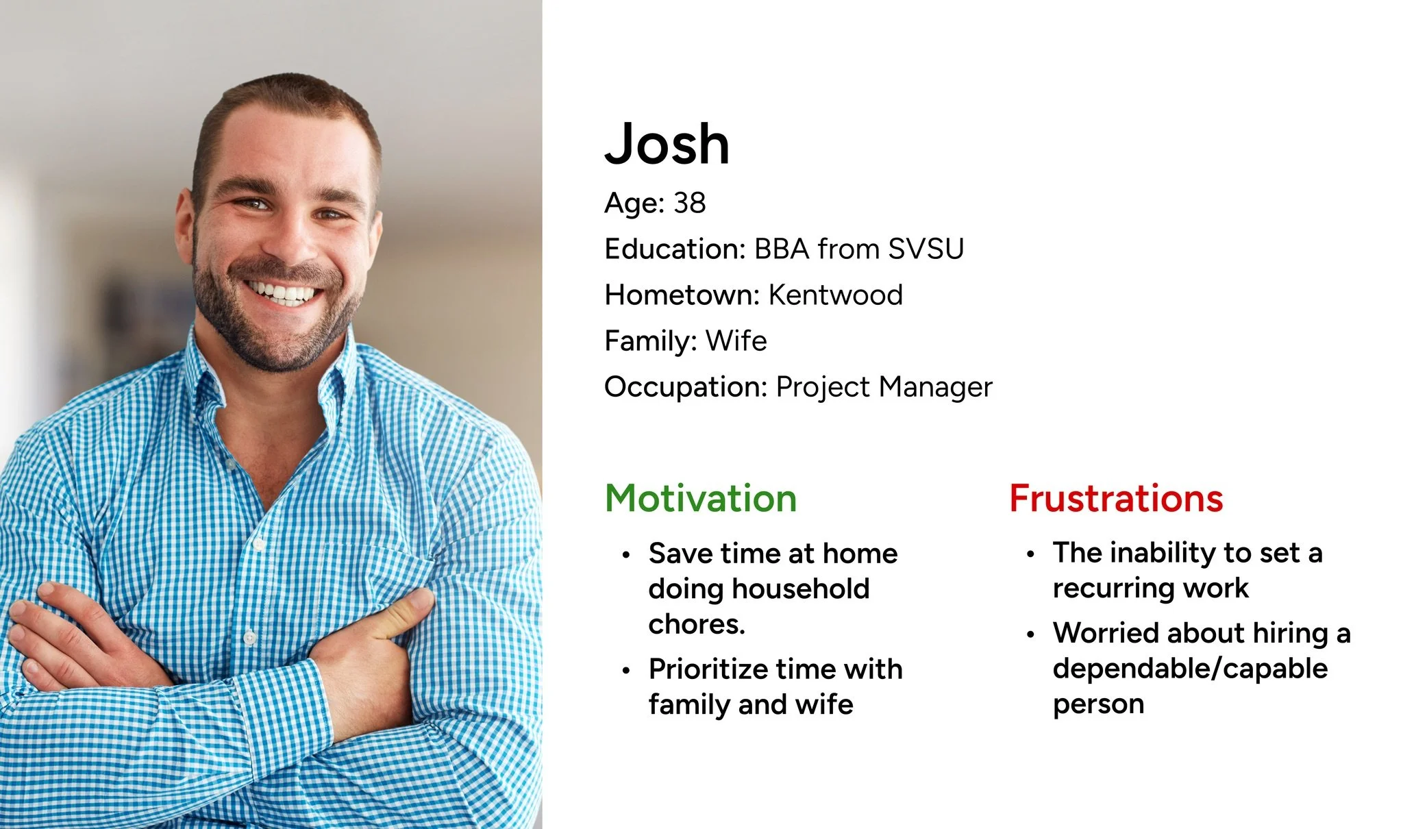
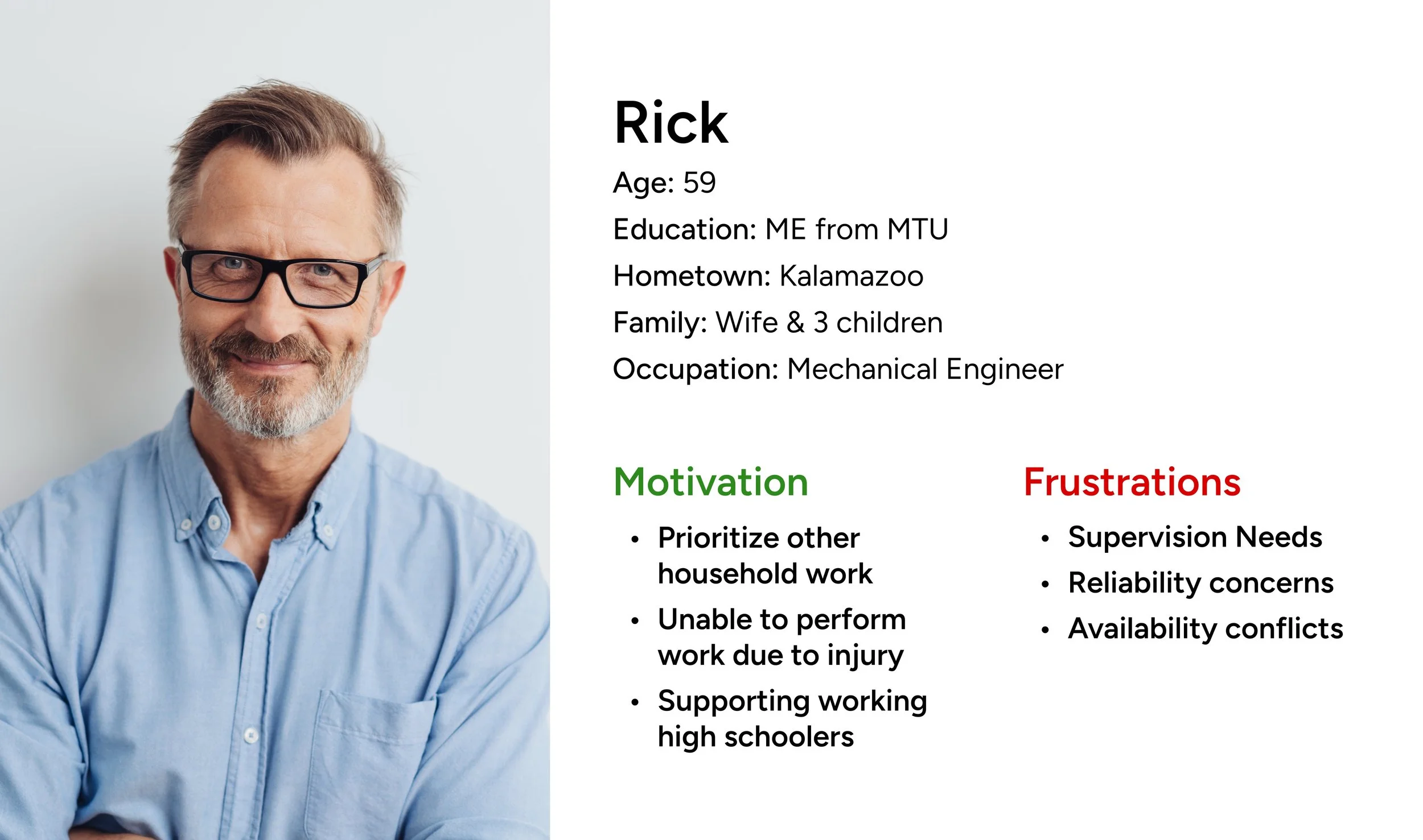
Personas
To develop the personas, we conducted user interviews to gather insights about potential users of the app who are seeking to find and hire student contractors. These users were primarily individuals aged 30-60, who would likely benefit from hiring student contractors for yard work or other odd jobs.
The interviews were conducted via a Google survey, which included questions about users’ wants, needs, and frustrations related to similar apps they may have used or would like to use. Participants were also asked to describe their current habits for hiring contractors and their preferences when using digital platforms.
The survey featured open-ended questions and prompts such as:
“What is the biggest frustration you experience when looking for and hiring contractors?”
“What features would make this process more helpful and easy?”
Method Findings
Participants were frustrated by the lack of a way to schedule recurring tasks, making repeat requests a hassle. This shows the need for a recurring service feature.
Recurring Services
Contractors emphasized the importance of reliable workers, revealing a need to show student ratings and experience for informed hiring decisions.
Dependable Students
Delays and unclear messaging led to user frustration and even service cancellations. This points to the need for improved communication standards between contractors and students.
Communication Issues
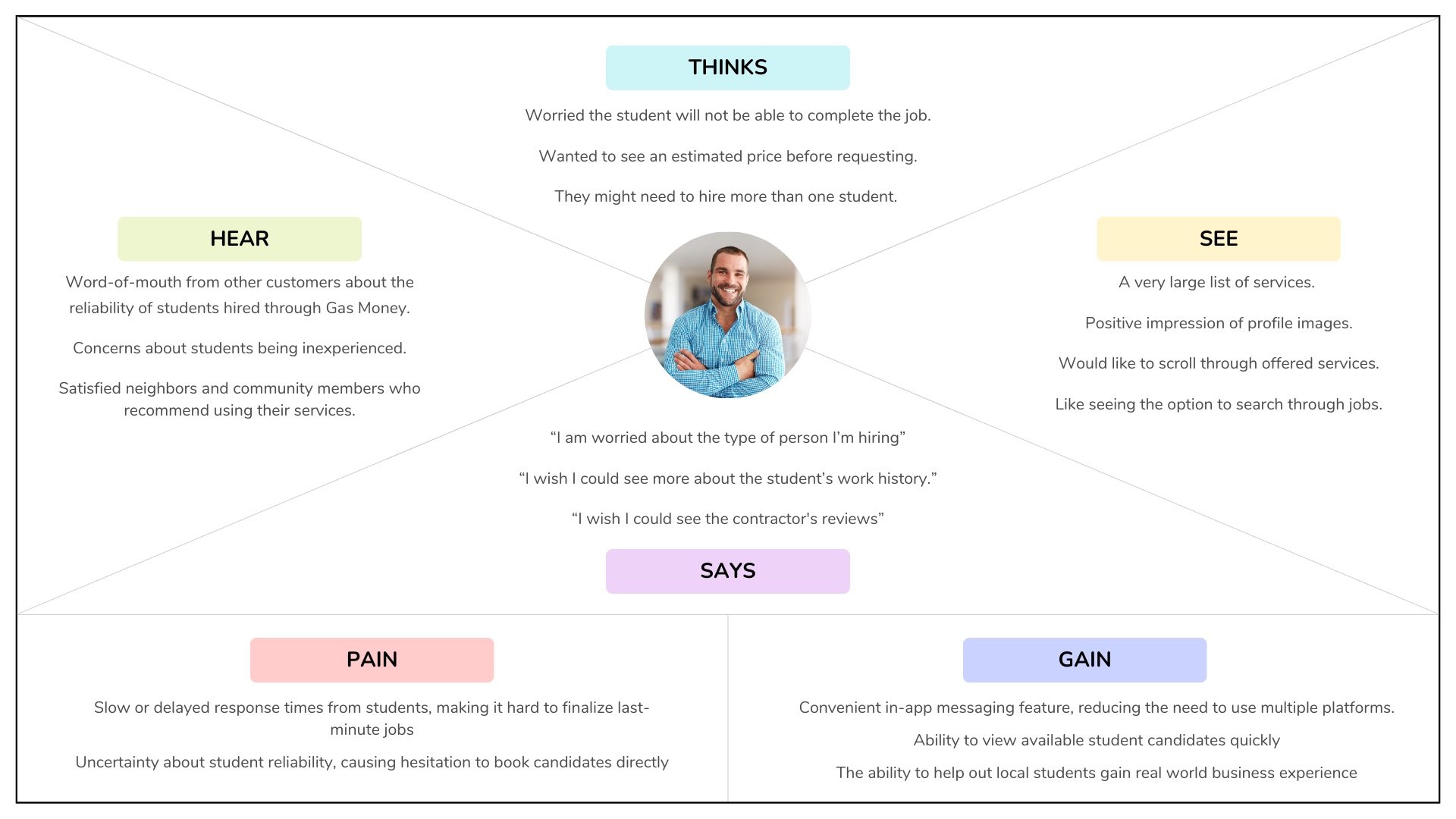
Empathy Mapping
To better empathize with users, we conducted empathy mapping by observing their thoughts, emotions, and actions as they navigated the Gas Money app. We organized our findings into four key quadrants—says, thinks, hears, and sees—which helped us uncover deeper insights into their motivations, frustrations, and expectations, ultimately guiding more user-centered design decisions.
Method Findings
Participants expressed hesitation about trusting students to complete jobs reliably. This skepticism created a barrier to fully adopting the app, showing a need to build user confidence through transparency, ratings, or verified profiles.
Student Reliability Concerns
Users appreciated the convenience and security of the in-app messaging feature. It allowed them to communicate directly without needing to rely on external platforms, reinforcing trust and ease of use.
In-App Messaging Benefits
Card Sorting
We used card sorting to evaluate whether the app’s content and navigation made sense to users. By observing how hiring-side users grouped and labeled services through remote sessions on Lyssna, we gained insights into their mental models. This helped us identify misaligned categories and improve the overall information architecture to better support user expectations.
Similarity Matrix: Numbers show the percentage of participants grouping these services.
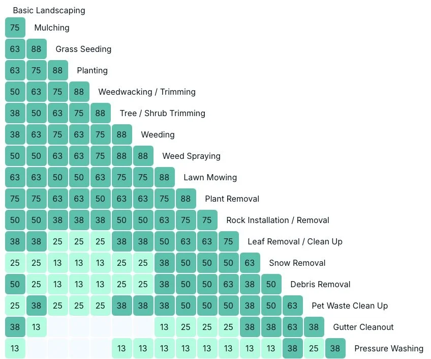
Services Offered
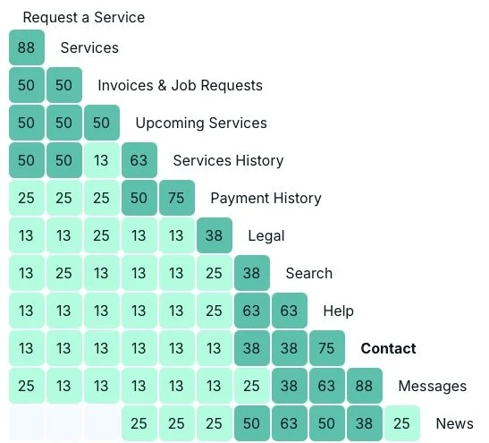
Navigation Elements
Method Findings
Users intuitively grouped offerings like leaf, snow, and debris removal into a single “Removal Services” category, highlighting the need for refined, user-aligned labels.
Clear Service Groupings
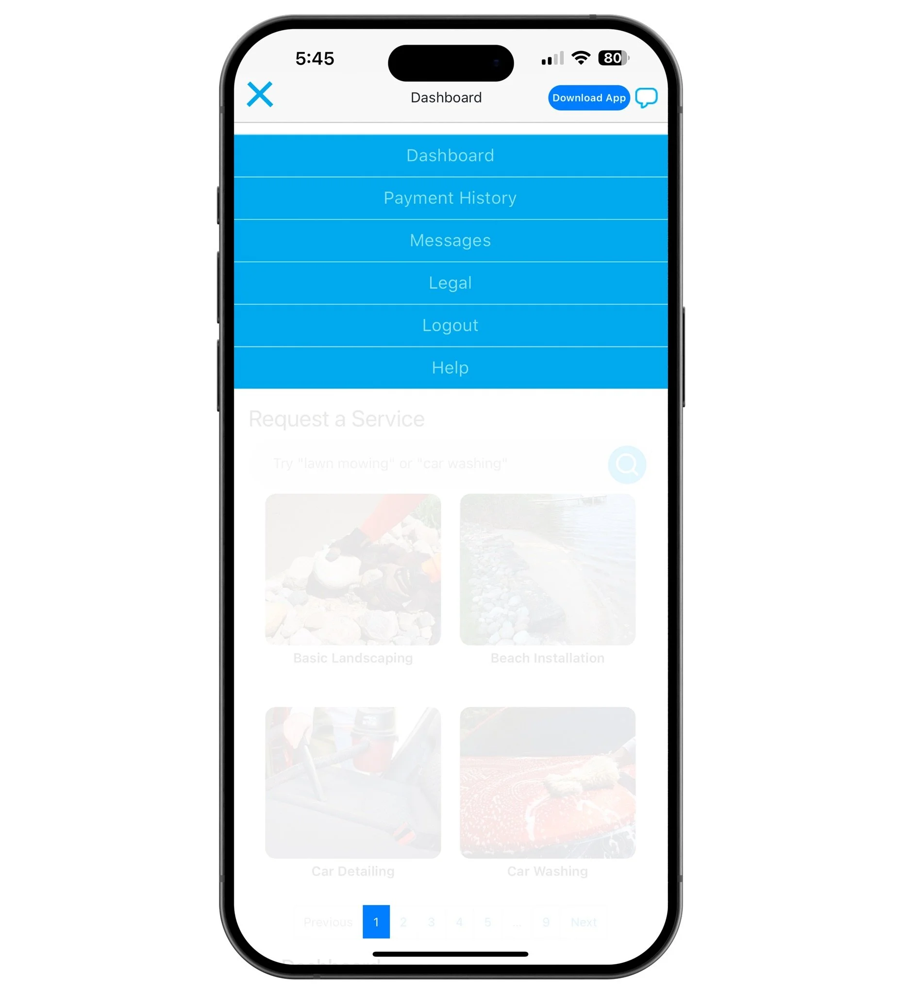
Participants struggled with vague labels like “Messages” and “Search,” and felt overwhelmed by too many options—pointing to a need for streamlined navigation and clearer terminology.
Confusing Navigation Items
Scenarios + Think Aloud Protocols
We conducted think-aloud sessions with 4 participants, who completed tasks like posting a job, browsing profiles, and messaging students. Each task was scenario-based (e.g., hiring for yard work), with participants verbalizing their thoughts. Sessions were recorded to capture audio, screen activity, and usability pain points.
User Statements
“I wish I could see the student’s experience level or availability in the contractor profile”
“Some of the icons did not do what I expected them to”
“There are a lot of services on here!”
“I like being able to see contractor’s previous work in images on their profile.”
Method Findings
Participants had trouble locating filters like "experience level" or "availability", which they expected to see. However, they appreciated the ability to search by keyword.
Contractor Search
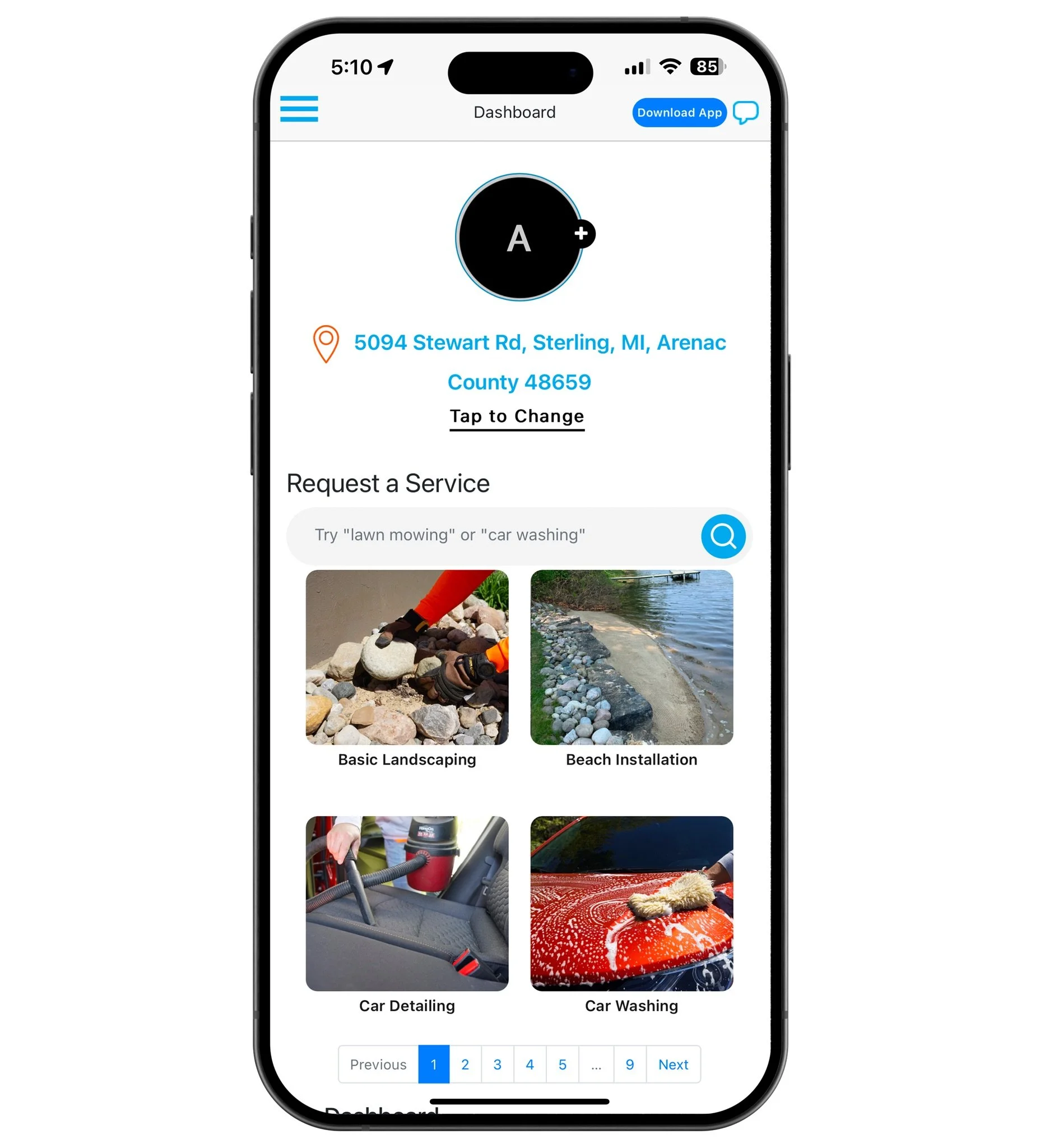
Users felt overwhelmed by the number of services and said they had to read through each one carefully to avoid choosing the wrong option.
Service Overload
The "Messages" icon was mistaken for a help chat, and users were confused that they couldn’t message students directly from the main screen—they had to go to each student’s profile first.
Messaging Confusion
The long list of job postings felt frustrating to scroll through. Users disliked how difficult it was to find specific jobs, especially when they were buried in the list.
Cluttered Job Listings
UX Recommendations

Categorizing Services
Simplify and clearly label service categories.

Adding a Bottom Nav Bar
Add a bottom navigation bar to allow for easier navigation within the app.

Enhance Contractor Search
Streamline the contractor search page with improved filters and a better search process.
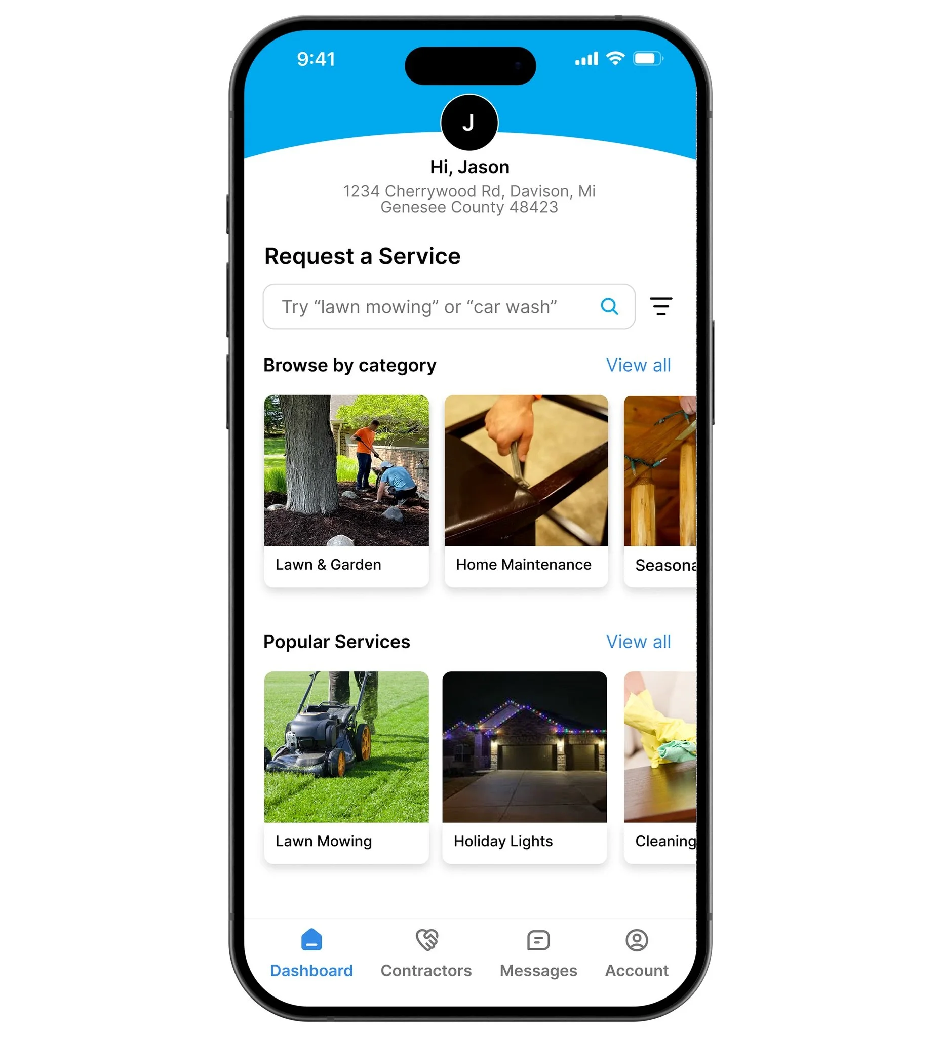
Organizing Services into Categories
We reorganized services into clearly labeled categories based on user feedback to better match how users naturally group tasks, making it easier to find what they need and reducing cognitive load.
Before

After
How These Changes Enhance the User Experience
Aligns app structure with users expectations
Reduces cognitive load, making navigation easier
Speeds up service location, improving task efficiency
Enhances user satisfaction and overall experience
Implementing a Bottom Navigation Bar
To improve navigation, we suggest adding a fixed bottom navigation bar with clear icons for key features like “Dashboard,” “Services,” “Messages,” and “Account.” This makes important tools easier to find, reduces confusion, and ensures a consistent experience across the app
Before
After
How These Changes Enhance the User Experience
Keeps key features visible and easy to access on every screen.
Replaces the confusing hamburger menu for quicker navigation.
Simplifies task flow by reducing the need to search for options.
Creates a more intuitive and user-friendly experience.
Enhancing the Contractor Search Page
To address the overwhelming contractor search page, we propose simplifying the layout by displaying only key details, such as availability, skills, and ratings, on each profile. Adding filters for attributes like experience level, location, and job type will help users refine their search efficiently. This streamlined approach reduces cognitive load, enhances decision-making, and ensures a clean, organized interface aligned with user expectations.
Before
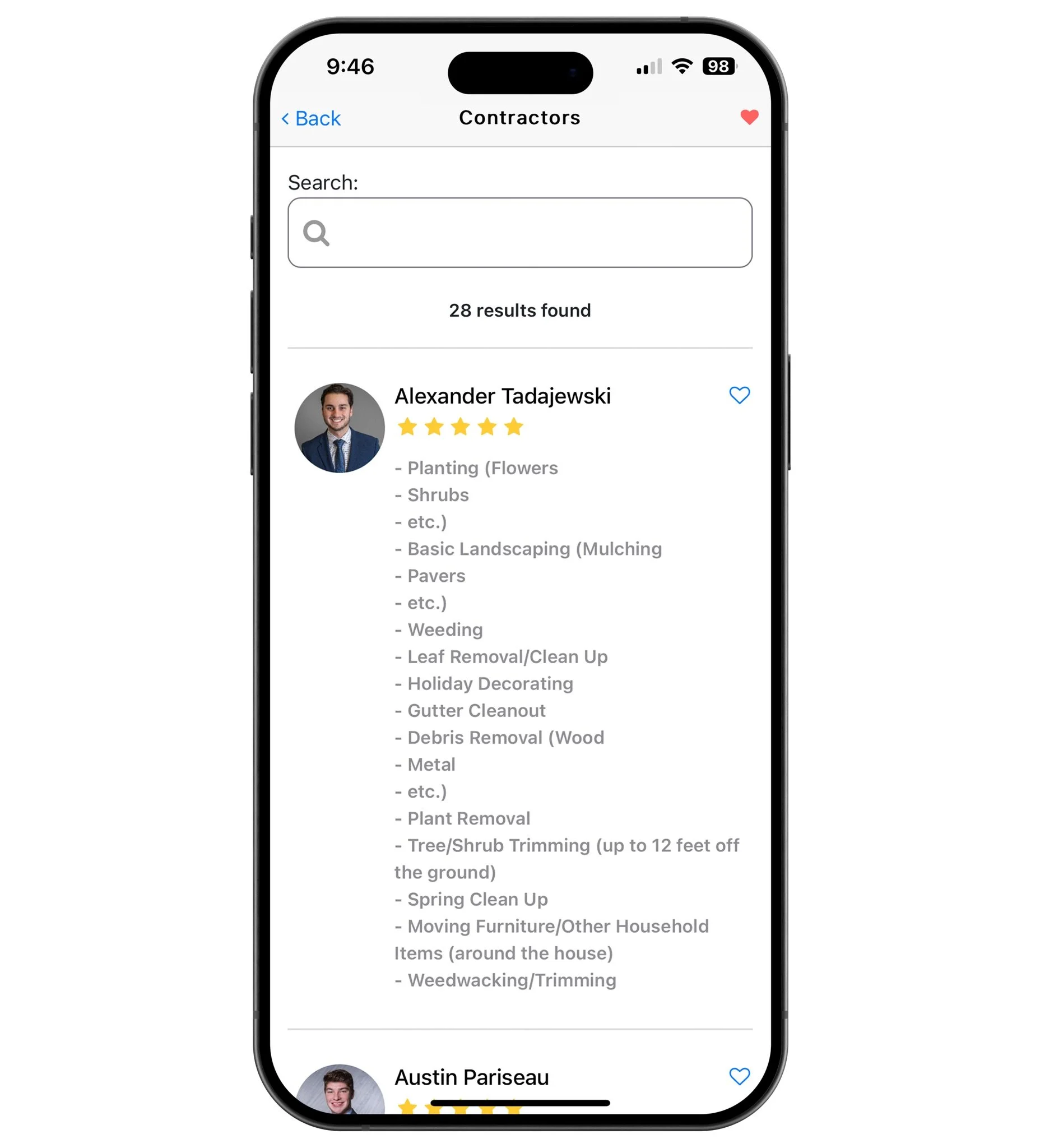
After
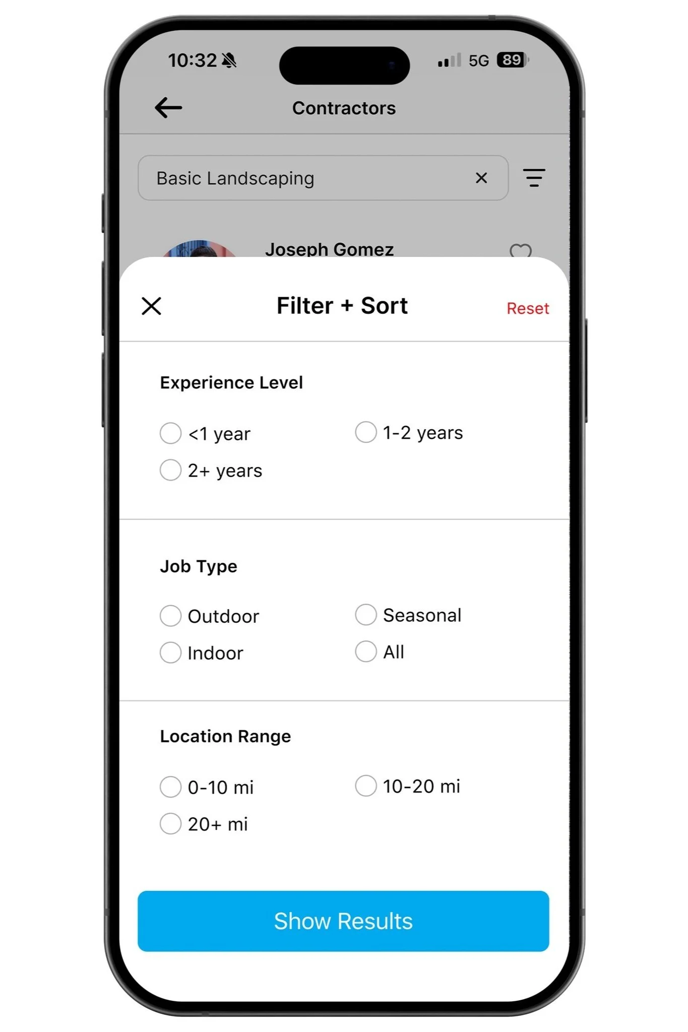
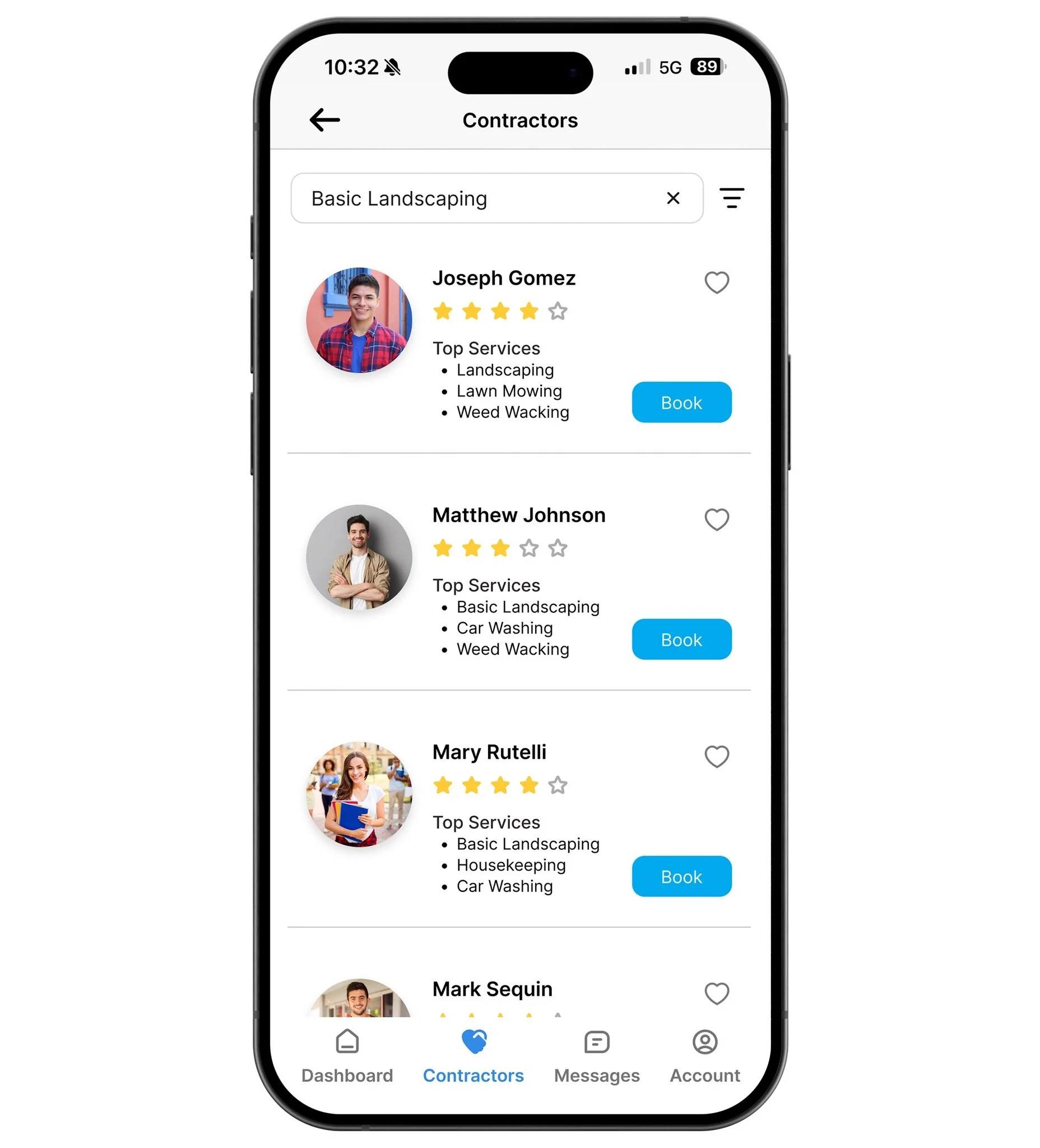
How These Changes Enhance the User Experience
Condensed service info to key details like ratings and top services.
Added search and filter tools to help users find what they need faster.
Reduced clutter by simplifying long lists and improving layout.
Made booking easier with a clear “Book” button for quick action.
Final Takeaways
Our recommended improvements aim to make the app easier to use and more effective for both homeowners and student workers. By simplifying navigation, organizing services, and highlighting key details, we expect users would complete tasks more quickly and confidently.
Better Engagement: A cleaner layout and clear categories could encourage repeat use.
Higher Bookings: Easier filters and a faster “Book” option could increase completed jobs.
Faster Decisions: Showing ratings and top services upfront would help users choose quickly.
More Efficient Use: Improved booking and messaging tools could save users time.
The client was happy with our insights and saw value in using them to guide future updates.